- Published on
What Do Geospatial Foundation Model Embeddings Actually Encode? I Ran an Experiment
The experiment
The setup is simple by design. I took 100 Sentinel-2 scenes from a sample subset of the SSL4EO-S12 dataset provided by the authors. The data contains four seasonal timestamps each, no labels. I ran them through Prithvi-EO-2.0-300M-tl with no fine-tuning, extracted the embeddings, pooled them to one vector per scene, and clustered. If the embeddings are meaningful, scenes with similar information should cluster together. If they're not, the clusters should be arbitrary.
One important caveat upfront: Prithvi was trained on HLS data at 30m resolution. HLS is a harmonized product that composites Landsat and Sentinel-2. I ran this experiment on native Sentinel-2 L2A at 10m. This matters, and I'll come back to it.
What are embeddings?
Geospatial foundation models like Prithvi are large neural networks pretrained on massive amounts of satellite imagery. This is done through self-supervised learning (SSL), where the model learns from the data itself without requiring labeled examples. The idea behind pretraining is that a model that has seen enough diverse imagery will learn general-purpose representations of what Earth's surface looks like, which can then be adapted to specific tasks like flood mapping or crop classification with relatively little labeled data.
The key output of that pretraining is an embedding, a compact numerical vector that summarises what the model has learned about a given image. You can think of it as the model's internal description of the image. If the model has learned something meaningful, images that share underlying characteristics should produce embeddings that are close together in that numerical space. Images that are fundamentally different should be far apart.
The size of that embedding vector varies by model. This is a design choice that reflects the model's capacity to encode information. Larger dimensions can capture more nuance but are more expensive to compute and store. For example,
- Prithvi-EO-2.0-300M — 1024 dimensions
- Prithvi-EO-2.0-600M — 1280 dimensions
For a single image, that process repeats across every patch in the image producing hundreds of these 1024-dimensional vectors, one per patch. This is what is called a patch-level embedding.
To get a single representation for each image, these patch vectors are averaged together into one 1024-dimensional vector. This is called average pooling, and the result is what we call a scene-level embedding. This single point in embedding space that summarises what the model saw across the entire image.
To make it a bit more clearer, lets look at how embeddings are generated using a simplified Prithvi 300M model as an example.
How embeddings are generated
To generate embeddings, each input image is divided into non-overlapping 16×16 pixel patches. For a 224×224 pixel image, this produces a 14×14 grid of patches with 196 patches in total. Each patch is then linearly projected into a token, a fixed-length vector that serves as the input to the transformer model. The output is one 1024-dimensional embedding vector per patch with the total embedding 196 x 1024.
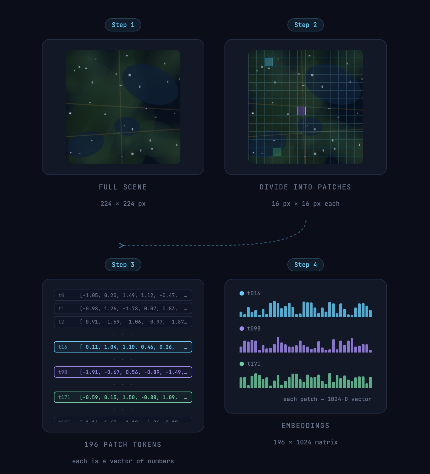
A simple demonstration of an image generating a patch-level embedding. Image is for demonstration purpose only.
What makes Prithvi different from a standard vision model is that it also encodes time and location alongside the image patches. The "tl" in Prithvi-EO-2.0-300M-tl stands for temporal and location, meaning the model processes multiple images across different time steps together, where each image is divided into patches and stacked along the time dimension. This allows the model to learn how the same location changes over time, which is particularly useful for tasks where seasonal patterns matter. This is why Prithvi is good when you have multi-temporal imagery and want to use a pretrained model.
Visualising patch-level embeddings
A 1024-dimensional patch embedding is impossible to visualize. A common approach is to take all the patch embeddings for an image, apply PCA to reduce them to 3 dimensions, and map these to RGB channels. Each patch is then placed back into its original grid position in the image, producing a low-resolution color map where patches with similar embeddings appear as similar colors. This is a standard way to probe the structure of patch-level representations. Many models use this kind of visualization to show how learned features organize spatially across an image. When the representation is well structured, similar regions often appear in similar colours. However, PCA is only a compressed projection of a high-dimensional space. A noisy result does not necessarily mean the embeddings lack meaning, though it is worth investigating why.
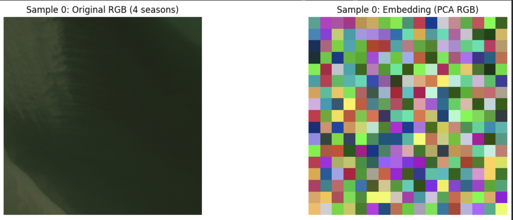
A noisy PCA visualization from the experiment. My hypothesis is that this is a result of how the PCA was applied.
Visualizing scene level embeddings
To find groupings in the embedding space I used k-means clustering, which separates the 100 scene embeddings into k clusters based on their position in the full 1024-dimensional space. To decide how many clusters to use, I computed the silhouette score for different values of k. As described in the machine learning mastery blog, the silhouette score quantifies how similar each point is to its own cluster compared to other clusters. It ranges from -1 to 1, where a score close to 1 means clusters are dense and well-separated, a score near 0 means they overlap, and a negative score suggests a point may have been assigned to the wrong cluster. Running k-means for K=2 through K=10, K=3 produced the highest silhouette score of 0.441, with scores declining steadily beyond that. However, when I visualised the results at K=4 which scored 0.402 the clusters revealed a more semantically meaningful separation. This illustrates a known limitation of the silhouette score. A metric tells you something about the shape of the embedding space, but only looking at the actual images tells you whether the groupings make sense.
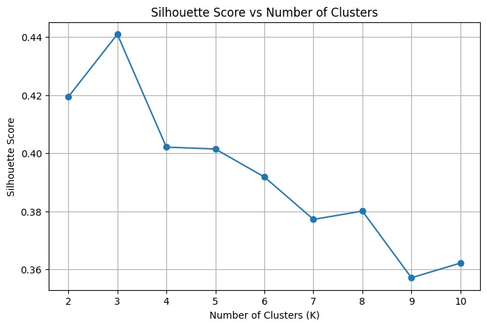
Silhouette score for different k cluster grouping.
To visualise the cluster, I used t-SNE (t-distributed Stochastic Neighbor Embedding), one of the most widely used techniques for visualising high-dimensional data. As Wattenberg, Viégas and Johnson explain in How to Use t-SNE Effectively, t-SNE works by measuring the similarity between data points in the high-dimensional space and representing those similarities as probabilities, then constructing a matching probability distribution in 2D that minimises the difference between the two. Points that were close together in 1024 dimensions tend to stay close in the plot, and points that were far apart tend to stay separated. The result is a 2D scatter plot where each point is one scene, and the cluster grouping from k-means are colour-coded onto the plot.
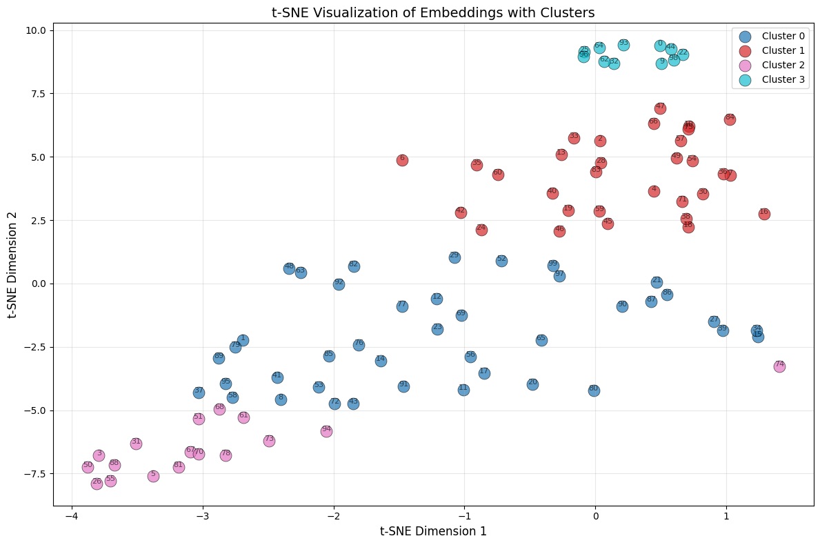
tsne plot for the scene-level embedding.
Visualizing the grouping
As seen in the plot above, each point represents one scene and the colours indicate the cluster group obtained from k-means (with k=4). Some clusters form compact and well-separated groups, particularly cluster 2 in the top-right and cluster 3 in the bottom-left. This suggests that the embeddings contain meaningful structure: scenes that are close in feature space tend to group together. At the same time, some overlap between clusters is visible.
To understand what these clusters actually represent, I visualised the images within each cluster side by side. The t-SNE plot shows geometric structure, but only the images themselves reveal whether that structure corresponds to something semantically meaningful.
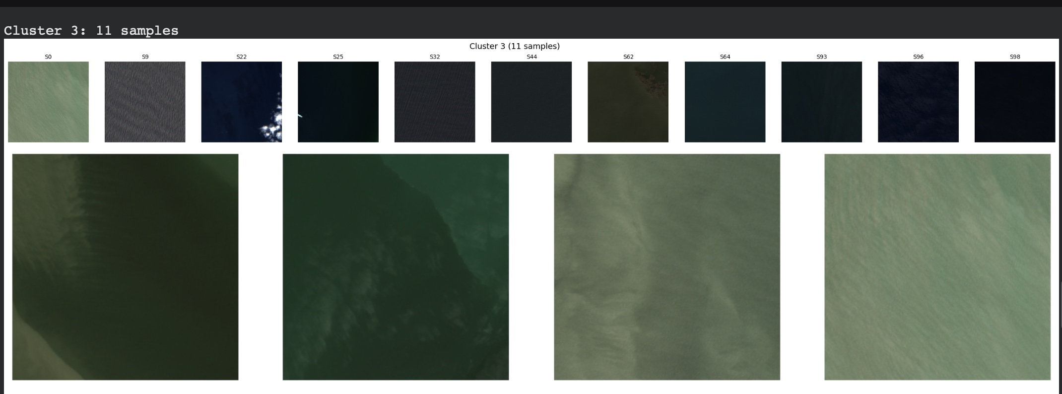
Cluster 3, the most clearly separated group, contained 11 scenes showing water. Although the scenes varied in appearance,the model consistently grouped them together. Water has a strong and distinctive spectral signature which is why it is one of the easiest land cover types for model to identify and seperate, and the embeddings appear to capture that signal reliably.
Cluster 2 contained 17 scenes dominated by arid and semi-arid landscapes, such as desert, dry scrubland, bare soil, and sparse vegetation. These surfaces share similar spectral properties, which likely explains their grouping.
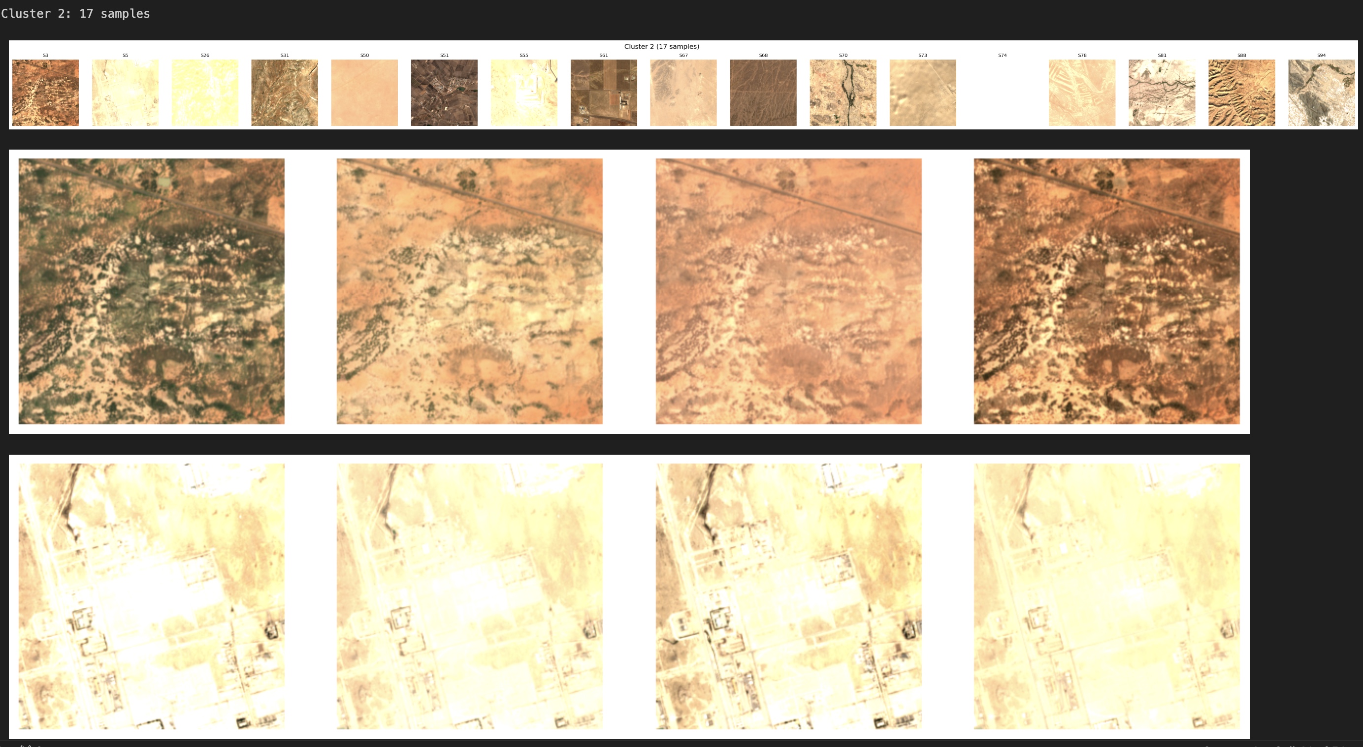
Scene 74 is an interesting example. Although the clustering algorithm assigned it to Cluster 2, its position in the t-SNE plot places it closer to Cluster 1, suggesting that its embedding shares characteristics with both groups. The image quality appears somewhat degraded compared to other scenes in the cluster, which may have subtly shifted its position in the feature space toward the boundary between the two clusters.

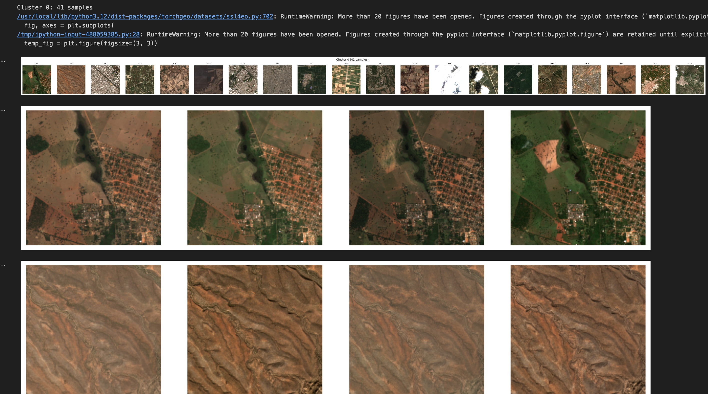
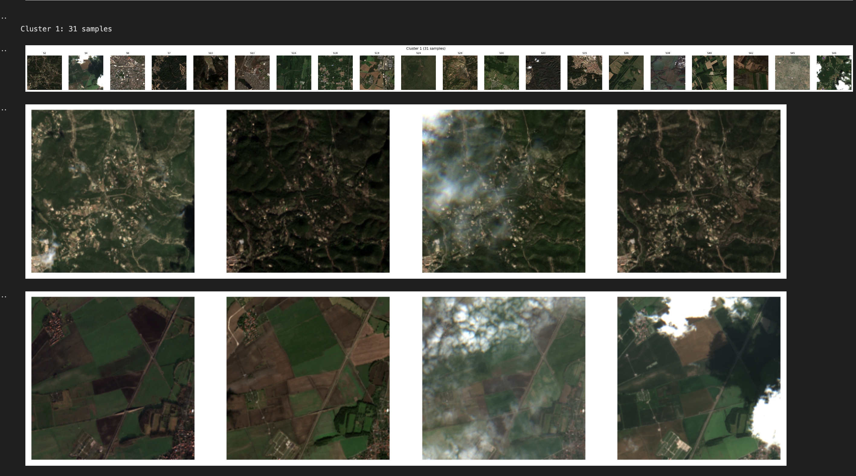
The remaining two clusters are less cleanly separated. Both includes a mix of vegetated and urban scenes, with noticeable overlap. Urban areas that contain trees and parks share spectral similarities with vegetated landscapes, making clear separation more difficult. This was also visible in the t-SNE plot, where those clusters appeared closer together, suggesting weaker separation.
Cluster 0
Cluster 1
What this tells us about what foundation models learn
This experiment suggests that Prithvi’s pretraining produces representations that encode broad spectral categories. Water looks like water, regardless of where it appears. Desert looks like desert. These surface types have strong and consistent spectral signatures across the training distribution, and the model appears to capture that regularity in its embedding space. However, finer distinctions such as, separating urban areas from vegetated regions are less clean. Urban environments often include trees, parks, and mixed surfaces that share spectral similarities with natural landscapes. Without supervision, the model does not always separate these subtle categories clearly.
What this means in practice
While the scene-level embeddings look good when we examine the cluster groupings, the PCA from the patch level did not give the desired result. My observation is that this is either a problem with the way the PCA was done or the resolution mismatch. This remains an open question worth investigating further. 100 scenes is enough to explore the method, but not enough to draw strong conclusions. A larger and more diverse sample across different land cover types would likely produce more stable clusters and more reliable patterns. This experiment shows that pre-trained embeddings carry real signal at the scene level. The model was able to distinguish broad land cover categories without any labeled data or fine-tuning, which is a useful baseline for anyone considering using Prithvi for a downstream task.
However, if your task requires distinguishing spectrally ambiguous classes such as urban versus vegetation, or different crop types, fine-tuning will likely be necessary. The pretrained representations capture dominant surface characteristics, but they do not automatically separate subtle or overlapping categories without labeled supervision.